Nội dung chính
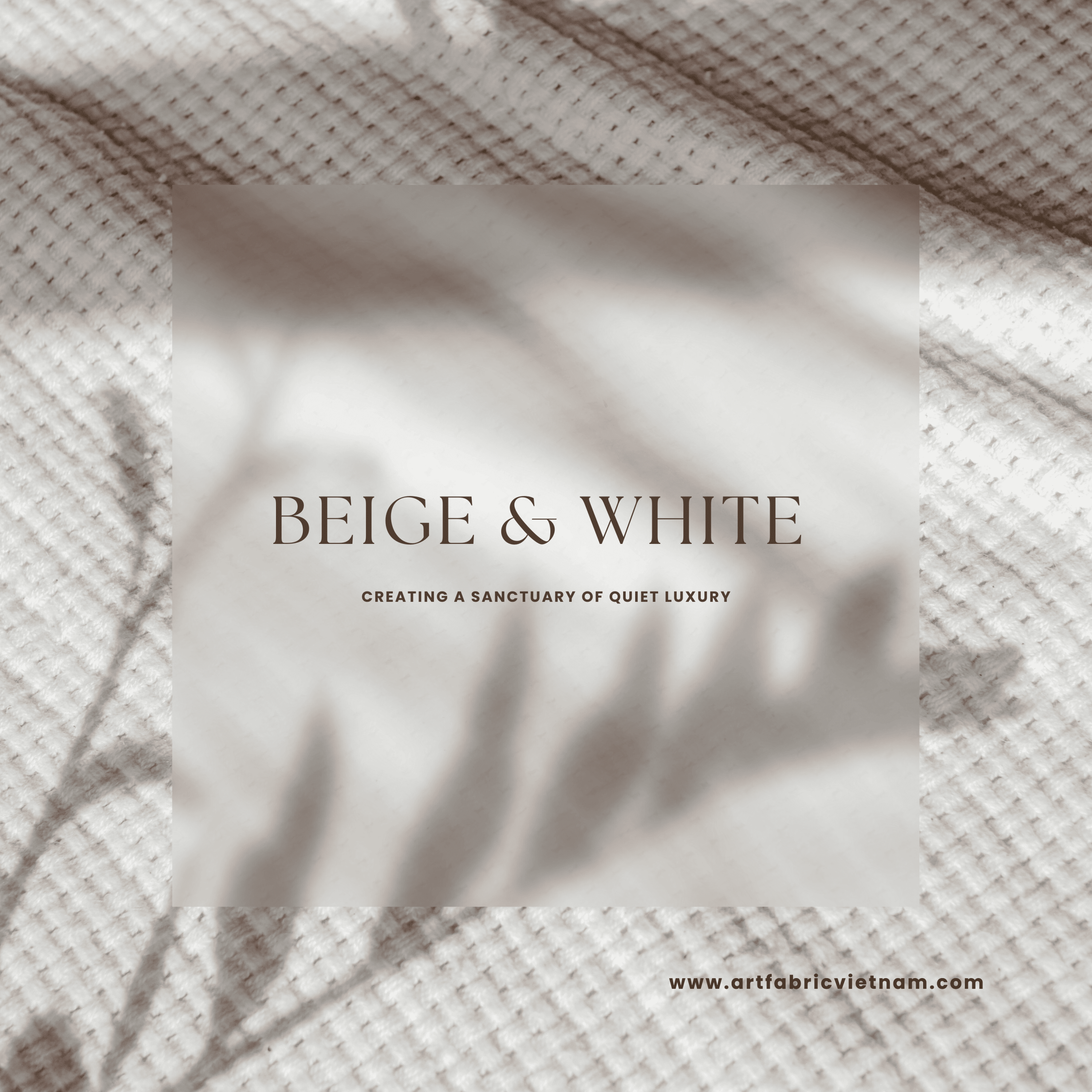
The Refined Harmony of Beige and White: Creating a Sanctuary of Quiet Luxury
In a world saturated with digital noise and visual clutter, the contemporary home is becoming an increasingly serene sanctuary—a place dedicated to calm, clarity, and peace. This desire for tranquillity has fueled the enduring relevance of a colour palette that speaks volumes through its subtlety: the exquisite harmony of Beige and White.
Far from being boring or bland, the strategic combination of Beige and White is the foundation of “Quiet Luxury”—an aesthetic defined by quality, texture, and sophisticated restraint. It’s an approach that ensures your space feels timeless, elevated, and deeply soothing.
1. The Enduring Appeal of Beige and White
Why do these two seemingly simple colours continue to dominate high-end design? Because together, Beige and White create a dynamic dialogue, offering balance, warmth, and an unparalleled backdrop for life.
1.1 The Power of White: Purity and Illumination
White is the ultimate expression of purity, clarity, and light. It immediately makes any space feel larger, cleaner, and more breathable.
- Reflects Light: Crisp White maximises natural light, making the room feel airy and open. This is particularly crucial for outdoor areas where the goal is to feel expansive and connected to the sky.
- Defines Edges: A pure White trim or ceiling defines architectural features, providing the necessary sharp contrast against softer, warmer tones.
- A Blank Canvas: It acts as the perfect canvas, allowing other elements—be they the grain of wood, a piece of art, or the texture of the fabric—to truly stand out.
1.2 The Warmth of Beige: Grounding and Comfort
If White is the light, Beige is the grounding warmth. It introduces an organic, earthy quality that prevents a space from feeling cold or sterile.
- Versatility of Undertone: The magic of Beige lies in its range. From cool, grey-tinged “greige” to warm, pink-hued “taupe” or deep “sand,” each undertone brings a different mood. Choosing a warmer Beige creates a cosy, inviting atmosphere, while a cooler tone maintains a sleek, modern edge.
- The Bridge Colour: Beige serves as the perfect intermediary, softening the stark contrast between pure White and darker accents (like wood or metal), ensuring a smooth, flowing transition across the space.
- Earthy Connection: The connection of Beige to natural materials—sand, stone, linen—brings an inherent sense of stability and peace, echoing the feeling that Earthy Brown Brings Security and Serenity.
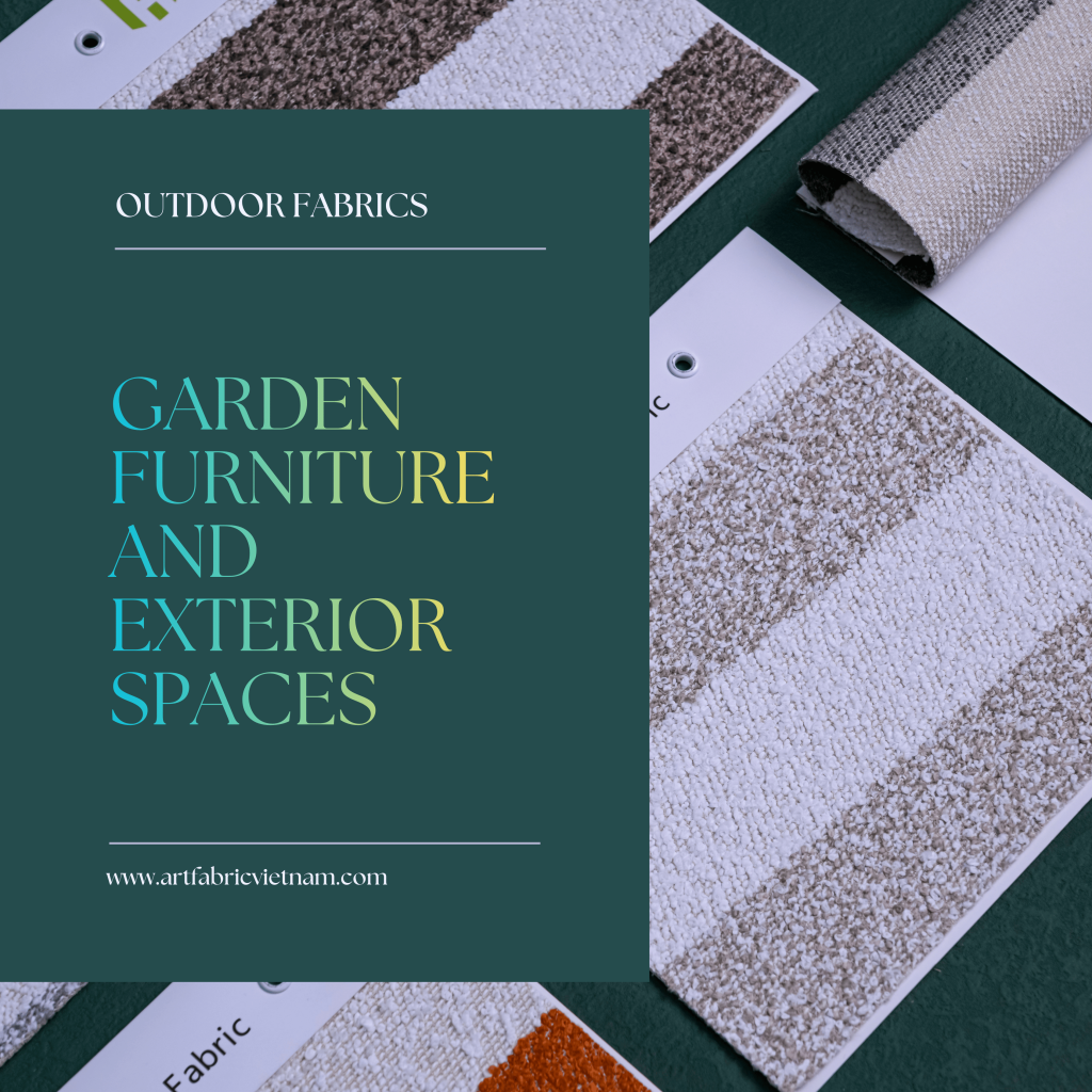
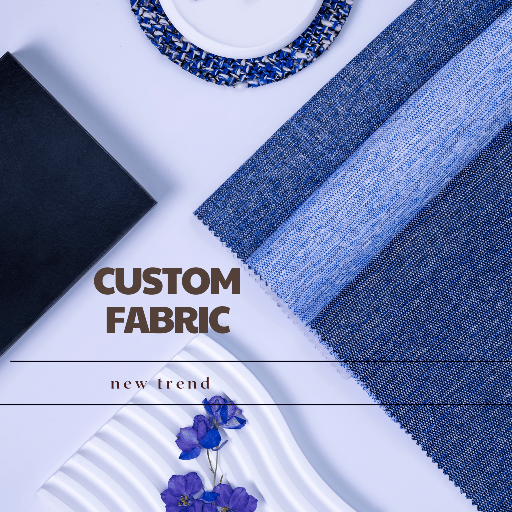
2. Mastering the Harmony: Layering Texture is Key
The secret to avoiding a “flat” or monotonous Beige and White space is texture. When colour is minimal, texture must take centre stage to add depth, visual interest, and a luxurious tactile experience. This is where high-quality fabrics become indispensable.
2.1. The Structure of the Weave
The way the yarn is woven creates texture and visual movement, essential in a monochromatic palette.
- Linen-Look (Slubbed Weaves): Fabrics that mimic linen, with slight irregularities and thick-and-thin yarns, offer a wonderfully relaxed and organic texture. This instantly softens the look of modern furniture.
- Basket and Herringbone Weaves: These structured patterns create shadow play, giving the fabric a three-dimensional quality. A White fabric in a herringbone pattern will appear much more dynamic than a solid flat White.
- Bouclé: The looped yarn structure of bouclé brings a sumptuous, high-end texture. Used sparingly on cushions or an accent chair in a deep cream or light Beige, it adds an inviting softness without overwhelming the space.
2.2. Contrasting Sheen and Finish
Varying the fabric’s finish ensures that light interacts differently with each surface, further enriching the palette.
- Matte (Absorption): Use matte finishes on large items (sofa upholstery) in a soft Beige to absorb light and create a feeling of calm depth.
- Subtle Sheen (Reflection): Introduce a gentle sheen on accent pieces (like silk-look cushions or light-reflecting outdoor performance fabrics) in a crisp White to catch and reflect light, providing that vital sparkle and lift.
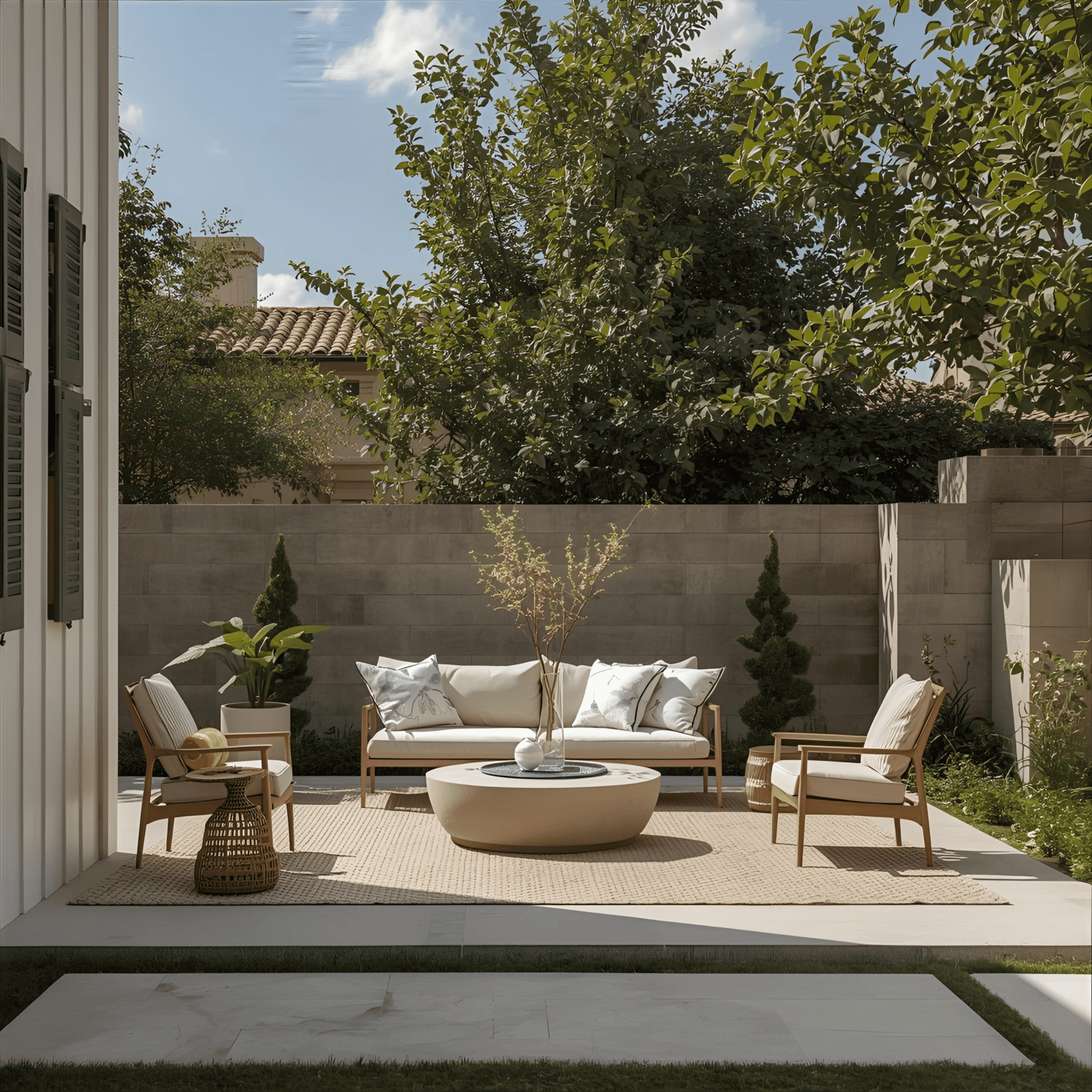
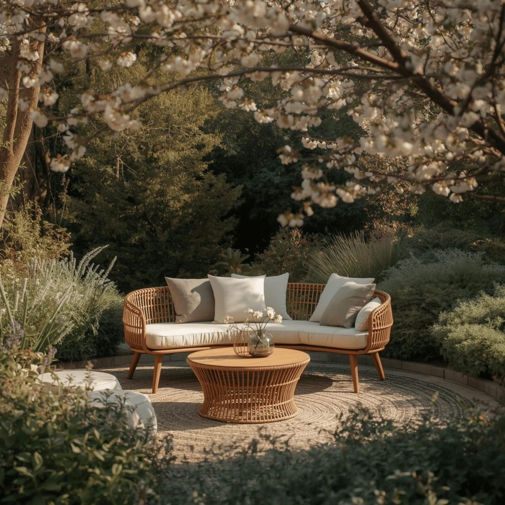
3. The Beige and White Palette in Outdoor Design
The Beige and White palette is arguably most effective in outdoor living areas, where it blends seamlessly with the natural environment while offering practical benefits.
3.1 Performance and Durability
Outdoor fabrics must deliver the aesthetic of luxury while meeting the demands of sun, rain, and humidity. This is where advanced textile technology ensures the Beige and White look remains impeccable.
- Fade Resistance: Nothing compromises the elegance of this palette more than fading. Yellowed White or patchy Beige destroys the refined look. Art Fabric Vietnam exclusively provides solution-dyed fabrics, where the colour is locked into the fibre from the start, guaranteeing superior fade resistance.
- Mould and Mildew Control: In damp environments, light-coloured fabrics are vulnerable. High-performance materials are engineered to resist moisture and prevent the growth of mould, preserving the clarity of the Beige and White tones.
- Art Fabric Vietnam’s Commitment to Health and Safety: We ensure that our luxurious outdoor fabrics not only look stunning but are also safe. Our commitment extends to avoiding harmful chemicals. To understand our safety standards and the unique benefits of our high-performance textiles, explore our commitment to quality, including our stringent testing for chemical safety and superior weather protection.
3.2 Strategic Accenting
While the foundation is Beige and White, successful design always allows for strategic accents:
- Natural Wood: Warm oak or teak furniture frames provide a necessary textural contrast and deepen the Beige tones.
- Metallic Touches: Matte black or subtle brushed bronze hardware on lighting or furniture adds a sophisticated, contemporary edge.
- Greenery: Lush, vibrant green plants are the perfect natural contrast, making the White look crisper and the Beige look warmer.
4. The Ultimate Expression of Refinement
The harmony of Beige and White in modern design is not a trend; it is a timeless philosophy. It is a dedication to quality over quantity, calmness over chaos, and enduring elegance over fleeting style.
By focusing on the subtle differences in tone and the rich complexity of textures, you can create a space that is not only visually stunning but also deeply resonant. It is the ultimate expression of Quiet Luxury, offering a peaceful, sunlit sanctuary for rest, connection, and effortless living. Invest in the finest materials—the true secret behind this enduring palette—and let the refined harmony of Beige and White redefine your home.